This issue occurs with the SDSU Twenty-Twenty template, where the mobile view hamburger menu and page spacing appear when viewing the site in desktop mode. This behavior is intentional based on the template’s design but can be adjusted to a wider “desktop” view by following the steps below.
The SDSU Twenty-Twenty template includes three built-in layout options. You can modify the layout using one of the following methods, depending on your editing preference:
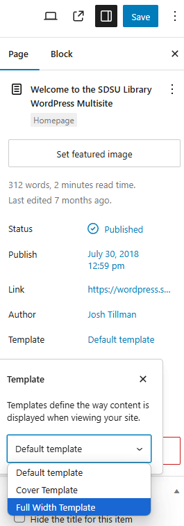
Option 1: Block Editor
If you are using the Block Editor:
- Select the “Page” tab on the right-side menu (or the “Post” tab for post content).
- Change the template to “Full Width Template”.
- Click “Publish” to apply the changes.
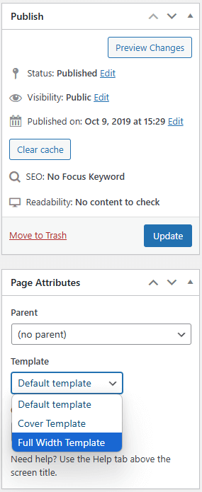
Option 2: Classic Editor
If you are using the Classic Editor:
- Select the “Page Attributes” tab on the right-side menu.
- Change the template to “Full Width Template”.
- Click “Publish” to save the changes.
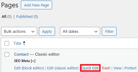
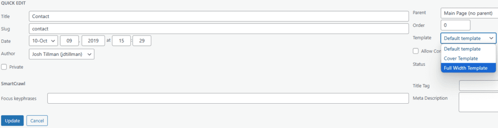
Option 3: Quick Edit Panel
- Navigate to the “Pages” or “Posts” menu list.
- Click “Quick Edit”.
- Change the template to “Full Width Template”.
- Click “Update” to save the changes.